Assignments
Datasets Used
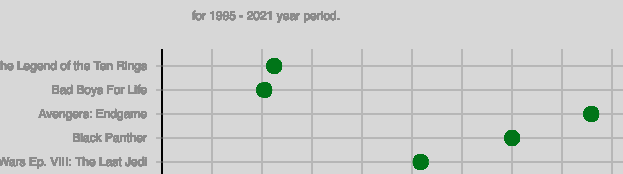
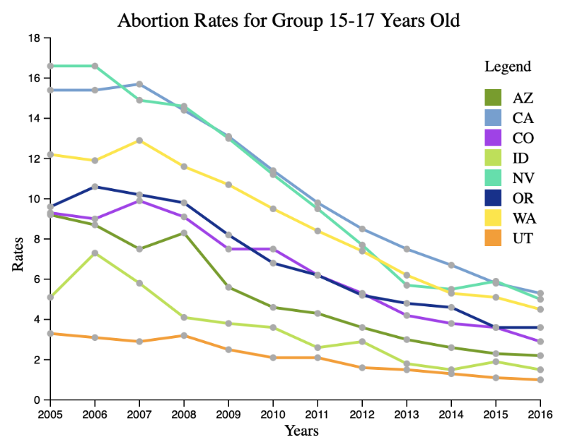
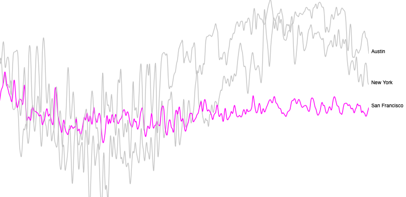
Data Visualization Assignments:
Assignment 1
Assignment 4
Assignment 7
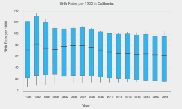
Assignment 10
Black Hat
- Title generalize for the entire year when on practice it is only about March
- Y axis start point is 294 that hides context and leads to the conclusion that highest prrices vary a lot
- Colors put additional misleading pressure on the difference between values
- Y axis name doesn't provide currency inforrmation
White Hat
- Title corrected accordiing to data
- Y axis start point changed to 0 and now we have a context where we can see that the differance between values is not that big
- Colors misled to conclusions and were removed
- Y axis name extended with currency sign
Black Hat
- Used data is misleading as prices are shown only for the last two month: March to April
- Title is misleading as those are not the highest prices for theis year
- Y axis name positioned far away
- X axis name is redundand and not informative: from the ticks and from the chart's name clear that it is about months of 2022
- Y axis name doesn't provide currency inforrmation
- Tooltip doesn't work
- Grid is absent which makes data less clear togather with the not working tooltip
White Hat
- Used data represents 2022 from the beginning
- Title corrected accordiing to the used data
- Y axis name positioning fixed
- Y axis name extended with currency sign
- X axis name removed
- Tooltip fixed
- Horizontal grid lines added to provide more clarity to values over time
- Data points added to improve user experience
- Width changed to better represent used data